We live in a technology driven and well-connected world where we are inundated with communication from multiple devices and applications 24/7. It’s no surprise that the volume of correspondence that we receive each day exhausts our attention. But what does this mean for the business who needs to get that important operational, marketing, or contractual message through to clients in a digestible way?
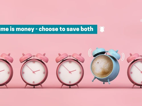
The fact of the matter is, your document only has a few seconds to capture the readers’ attention, communicate the message and the call to action. This can be a tall order, but by setting design objectives, it can be achieved.
5 Ways design could improve your communication
1. It’s all about your audience
Knowing the audience you are corresponding with will help you tailor your communication to more effectively reach them. For example, if you know your correspondence are being sent to older adults who might deal with vision loss, you’ll typically choose a font size of 12 points or more. The more you know about your audience’s culture, age and gender, the better you’ll pick up on design cues fit for the readers’ needs.
2. Iconography focusses attention
The set of visual images and symbols used in your correspondence are aesthetically pleasing elements that could capture your client’s attention. The purpose of these icons is to help your client easily discover important information in your correspondence and lightening the read intensity, making it easy to understand your message at first glance. These powerful visuals are used all around us, it’s our cues on the road, in the shops and on all sorts of digital platforms.
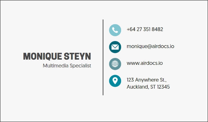
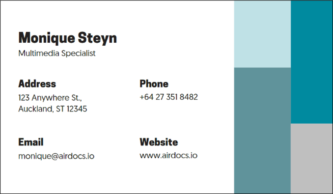
Here’s a simple example, it’s much easier to digest the information of the first image than the second image.
3. Infographics help to tell the story
According to Dictionary.com, an infographic can simply be explained as a visual representation of information, data or knowledge with the intent to present information quickly and clearly.
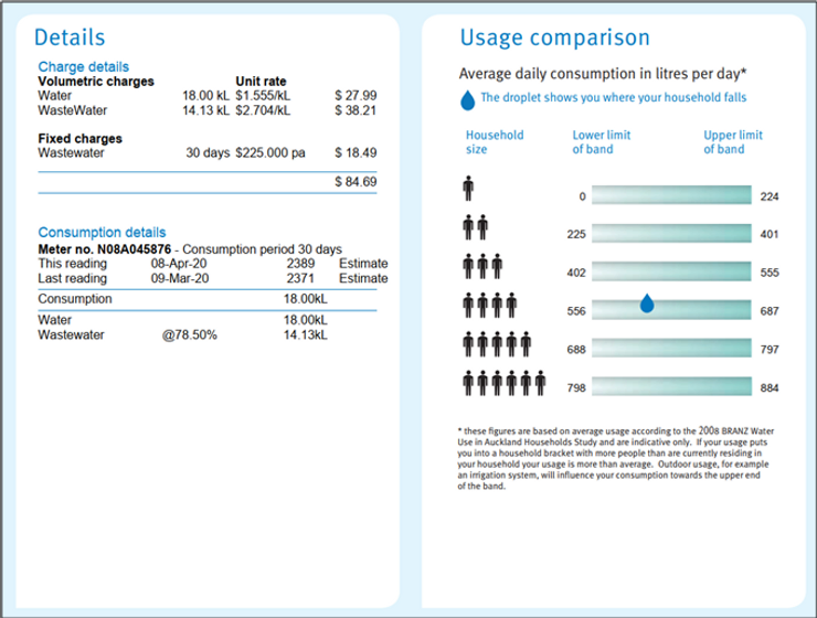
I absolutely love how infographics can turn your customer correspondence into an impactful story, how boring or even complex data can be shaped into a powerful visual representation. Studying statements and tax invoices, I’ve discovered a particular example on a water bill (reference the below example image, a snip on the second page of a two-page water bill). This designer definitely understands that by the time a client turns to the second page of the statement, the attention span is lowered and the reader are likely to only scroll through the page for important information. If the information in the “usage comparison” block was conveyed any other way than the infographic format, I would most likely miss the information. But because I could see that the water drop falls into the lower band limit for a household of 4 people, I could immediately conclude if the household is using water wisely or not.
Replace that unnecessary lengthy text or data from your client correspondence with an enjoyable story that’s carved into your audience’s memory and easy to understand.
4. Choose white space instead of noise
White space is that unmarked areas between design elements. It isn’t necessarily only in the form of white margins or padding in your correspondence, but can also include colours, background images or even patterns. If you really want your content to be absorbed by your reader, instead of filling each corner with content, consider leaving a bit of “breathing” space between elements which will help your audience easily consume the message.
Not only are we considering how much is absorbed when your correspondence is being read, but also the underlying emotional triggers activated. Think about how you feel when you are walking into a small room with a low ceiling and paintings as decoration from wall to wall. Now, think about how you feel when you are walking into a spacious room, with a high ceiling and a few paintings strategically spaced. The first scenario can easily make you feel anxious, nervous and restless whilst the second scenario makes you feel calm, free and focussed. This practical example is relevant to your document design, so choose to get the most out of your correspondence message by including enough white space.
5. Typography invokes your mood
Even before you’ve started reading a document, the typeface has already started telling you all about the sender’s personality. It channels energy such as excitement, kindness, ruggedness or stylishness, therefore, it’s wise to know what energy your brand personality should convey and carefully select those typefaces to present you in the eyes of your reader. Here’s a few pointers I use when choosing fonts in a way that will improve a document design:
The main objective is to ensure that the font is easy to read. Some font families are very stylish, but almost impossible to read.
- Choose no more than three typefaces with the goal to help distinguish between headings, subheadings and body text in your document.
- Start by determining the font of the body text and then pair fonts that compliments it.
Impact of good design on your communication success
The old saying: “the first impression is the lasting impression” is one that’s still relevant today. How your customer correspondence is presented to your audience, can be the difference in choosing you over a competitor for a service. Choose to send client correspondence which not only has strong message content, but also represents your brand and your personality.
If you expect your message to be easily understood and absorbed by your reader, it is essential to invest in the design efforts to support the intent of the communication. Through our extensive knowledge and experience in this field, Airdocs will assist you in achieving your communication goals via the device, channel and format of choice.
This quote by Shane Meendering couldn’t be truer: “Bad design shouts at you. Good design is a silent seller.”